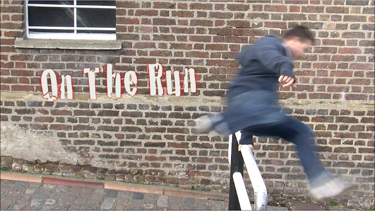
The style of the titles themselves are shown drenched in blood, they appear in a normal san serif text then blood appears to sweep the text away as if someone blowing through a straw. the sequences are shown after a slight glance of the zombies, this timing makes the the title sequence look more thrilling as the audience will not know what might might pop up after the text has shown. the style of the title is set up by the importance of the letters, 'Dawn and Dead" are shown in big bold letters which indicates what the film is about, down indicates dark and dead creates suspense and thriller
