Friday, 23 April 2010

EVALUATION | Question 2

How does your media product represent particular social groups?


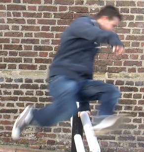
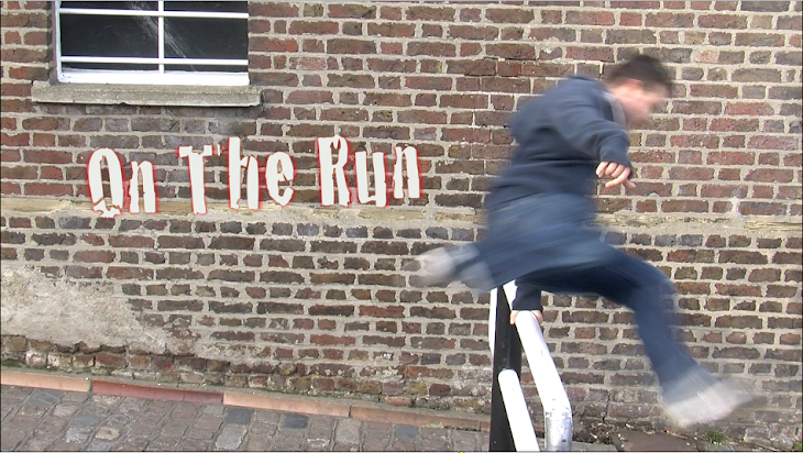
Our protagonist is presented as a slightly cheeky ill composed young man. He represents a social group that is familiar with being looked down upon by those who consider themselves to have lived a wealthier lifestyle, but he knows just like many working class lads fighting to prove themselves in a city like this that his life has been rich and that wealth is something more metaphysical. We knew that by simply dressing him in a hoodie the viewer can begin to make assumptions as to his background, while not all of them positive this sort of stereotyping is widely used in the media. What is important in stereotyping a films protagonist is that you get people to question the stereotype by building upon the preconceived character throughout the story. I think we were more inspired by our own experiences and the knowledge that many people out there will be able to relate to them rather than another film when coming up with this character but you could say he stands as a polar opposite to many personalities seen in thrillers.
Take Tom cruise if the film Collateral for example:


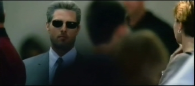
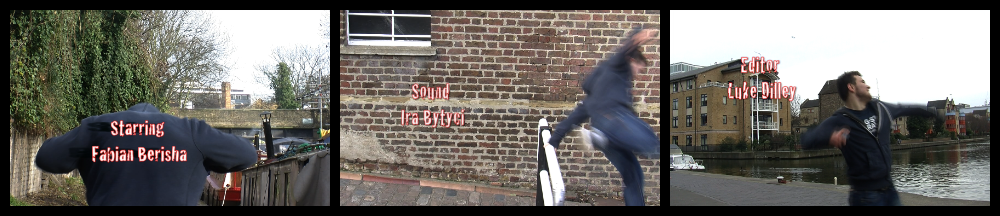
The screen captured above is something i see as quite the opposite to the film we produced. The man above is moving steadily and assuredly in a crowd of people, quite different to the frantic sweaty escape of our hero. He's smartly dressed, and subtly hides himself behind those sophisticated shades, where as our guy comes over as exposed and certainly has a more casual attire. I suppose our film plays off professional characters like Tom Cruises' assassin in collateral, knowing the viewer is already familiar with them from other movies, allowing us to present them someone quite different.

Evaluation 1


In what ways does your media product use, develop or challenge forms and conventions of real media products?

Our media product challenges forms and conventions of real media products by introducing many forms of conventions, these conventions are:

  • Setting a scene/ establishing a a place- by showing the character in a deserted urban canal this emphasizes to the viewer that the character is vulnerable as the canal is filled with graffiti and has a very claustrophobic feel about it due to the view that the end of the canal is the only way out. Our character is shown to be resting at a magnificent landscape when he is attacked this creates suspense by the landscape as this emphasizes that he is in a safe zone, later on he is sLinkhown looking at the lake and we see someone behind him.
  • Making the audience question what happens later in the movie- our product questions what happens later on the movie by not showing who is chasing him and why are they chasing him
  • Edit- the way our product is edited glorifies the titles, the film was edited to slowdown when the titles appear this makes the titles noticeable by the viewers, lots of real media products use this technique, this is used to make the cast, directors, etc.. known by fans.
  • Sound- the sound in our product is fast paced which builds up the tension as the actor flees for his life through the canal. there is a loud church-bell sound every time the slow-motion and the titles appear on screen.
  • The titles- the titles on our product are shown in white text with a bright red glow around every letter, the titles flicker across the screen making a scary scenario. the sound, edit and titles all contribute in making the titles appear affective in thrilling the audience.

Evaluation question 1

In what ways does your media product use, develop or challenge forms and conventions of real media?

Our whole title sequence follows the convention of creating a mystery as no one knows why the character is running until the end when the audience are introduced with a reflection of somebody else in the water. The title sequence was a suspense builder as the audience were unsure of what it was that was after the main character and what had happened before this.It ended with a cliff hanger which was very effective and chilling, again utitlising a commonly used convention used in the opening of thriller films. . During the sequence we had a long shot, this could be seen as someone watching our main character from a distance causing tension. We used slow motions in the scene to emphasise the characters need to escape, the fact the he would jump over things instead of simply walking around them showed that he was desperate to escape and was not in a state of mind of thinking clearly, also he desperately attempted to open the gate by kicking it open as he was in a hurry. The title 'On the run' speaks for itself as it is introduced right at the start and it follows up the next scene.

The music was upbeat and it provided pace. It started of slow as the tension was rising then it trailed of to a more upbeat style nearer the middle. The suspense builder was more during the end as the music went quieter.

Wednesday, 21 April 2010

Tuesday, 20 April 2010

Skills Audit- Editing


I have learnt how to use final cut pro efficiently and i have been through the BAIT tutorial. this tutorial showed me how to use every part of the software efficiently. in order to start up the editing software i had to click on macintosh HD and then find my way to final cut. the clips in my computer are shown in the browser which i can drag to the timeline, during the film i used "i" and "o" to cut bits of the film off and drag them to the timeline.

Saturday, 17 April 2010

Filming PROBLEMs

On Wednesday 14th we was going to go film the shots we needed however unfortunately Fabian forgot to wear the right Clothes! therefore we new we couldn't go do it because it would have looked strange with different clothes in the shots so we didn't think nothing of it got on with putting the shots together in the start of making our thriller opening. Me & Holly sorted through the clips we had filmed on our first filming day while Fabian and Era started on the sound track and Luke had a look with the different titles we could use. We made good progress and made a list of what we 100% new we needed for the Friday lesson what we new we was going to go film.

Friday 17th come, and everything was going w
ell the weather was in good condition and Fabian had the right clothes on. And we all remembered to wear warmer clothes so this time we wouldn't be cold.

HOWEVER! THEN

nobody thought to read the actual closure signs that had been put up weeks ago what we walked past when we started filming, so we got all the way down to the canal ready to film with our equipment ready, to find the spot we needed was all closed of, most of the canal by then had been closed of due to building works! We all felt a little disappointing and wasn't sure what we should do because we needed these few shots!
We walked up the canal to see if we could find another lock that looked similar to the one we had started filming from but we couldn't find anything like it however we did manage to do a few shots like the close up, and the splash in the water when he chucks his phone in the canal from the stress of nobody answering his call. We was walking back and we asked some police women that was walking down the canal, if they thought it would be possible for us to go threw the barrier since the door we needed was only about 2inches behind the barriers. They said to ask the workmen.


LUCKILY...

Holly and Fabian bravely asked the workmen if they would mind letting us threw just to film these last few shots and how important it was for our A Level Media! And the situation that we had come with. The workmen was obviously understanding and kind enough to get some sort of tool what he needed and opened the barrier for us to go through. And we then thanked them for their help.

Friday, 16 April 2010

EVALUATION | Question 1

In what ways does your media product use, develop or challenge forms and conventions of real media products?


Many of the thriller openings produced by my college and indeed seen in the cinema share similar traits. Filming conventions that have proven successful for the genre time and time again. In our film i think they're are several traits that really make this an action thriller, primarily it was the fast tempo soundtrack and solid editing but without some fantastic shots to work with we wouldn't have been able to set the pace at all.

What makes our sequence interesting to watch i feel is the varying distances and angles from which we filmed our protagonist. We had to make sure each shot showed built upon his situation instead of just repeating it, whether that was showing his movement alongside the canal or giving the viewer a closeup of his clothing.


Here's a high angle long shot, a mid-shot, and a very effective ground level shot all of which develop his position in the movie, revealing something new.
When we were editing the film we took a risk in making the running section considerably long, there was a concern that the viewer might lose interest but on the contrary i think this approach was a reliable method of building up questions in the viewers mind. They want to know who he is and why he's running so very hard and while it's not an approach taken by many films i'm sure you'll find a few of the very best thrillers do just that, for example, Memento which is a fascinating to watch because it is presented in such a non-linear fashion keeping the viewer entranced right the way through. So to get our audience interested we relied on the film convention that people love having questions that they can solve as they watch something through.

Photobucket


The editing was perhaps my favorite part, as already mentioned we used short clips or fast cuts, to set the pace for the film however i think the slow motion effect applied during the editing was one of our best decisions. We had considered using slo-mo when we planner our storyboard but we were aware that not many films we had seen had really utilized the effect, We reasoned that abuse of it might make the project look unnecessarily amateur, so, we gave it a purpose. The slow motion is there to emphasize the credits but i think what it does even more effectively is emphasize the speed at which our hero is moving. It's the contrast between our characters running and all those quick cuts with the slowed down footage showing the intricacies of his simple movements that make it particularly satisfying to watch.


And what would a title sequence be without the opening credits? Personally i was really pleased with ours! I think they were particularly well suited to our film because we really considered how best to implement them. We gave them a jittery movement that you gave you an impression of the state the protagonist is in after all his hectic running, and their speed meant they made a stronger impact and looked good when we complimented them with the slow down of footage. We also considered where to position them over the footage, take for example the first screenshot on the left below, if we had placed them up in the corner the viewer would have to treat the text and the characters movement as to separate things to take in, by combing them we make both more effective. In the second one we considered the way the character was moving and so the way their eyes would move across the screen, i think that was fairly important, we positioned our credits so that a viewer would be able to read them naturally and not have to constantly be darting their look back and forth across the screen. One of the classic film formula we used was putting in the title on black at the beginning, i think this makes a name more memorable, also the lack of video meant we were able to draw emphasis to the non-diegetic sound of his heart beat that we faded in and used as a sound bridge to transition into the footage, it was a good decision.


The final aspect of titles we had to consider were font style. We knew we wanted a sans serif style for an informal look and we went for something bold to leave a lasting impression, something that has always proven sucsessful in films, take for example Rocky or Fight club (see below). But that wasn't enough to make it an appropriate font, it need to reflect the, if you like, personality of our film. Which is how we decided on our font, with a slightly rugged edge, cracked in places or slightly skew-if- it really represented an aspect of living in London that our protagonist and many of our viewers will have grown up very familiar with. I think it's also a font that could be described as rebellious, which is certainly appropriate for our film and where i like to imagine it going, ( A sort of one man vs The Man story).


Three shots from the film Fight club that was very successful. Like us they also went with a bold font and considered the way it transitioned in relation to its surroundings, however this is an entirely bespoke sequence computer generated, quite different to what we produced but i like to think both worked well :)